evolve building supply
Website and marketplace design for salvaging building supplies
The Big Problem
The company founder hired me to build a brand new website where salvaged building materials could be saved from the landfill and reused in new projects.
Overview
Leah Barrett - Company Founder
Rachael Lubbers - UX & Web Designer
Start: April 2022
Duration: 1 year
Estimate of the amount of waste in the landfill associated with construction and demolition.
30-40%
Current estimate of when local landfills will run out of space
2040
Digging In - Research and Users
The Challenges
The ideal users varied greatly in their needs and limitations.
We interviewed numerous potential users to determine what features they would like to see in the marketplace site. We found that the users generally fell into three distinct categories.
Contractors: These users indicated that they would have a high volume of product that would be uploaded to the marketplace, either by themselves or by support staff. They wanted the process to be as fast and user-friendly as possible.
Designers: These users wanted very specific products. They needed a high level of detailed information in order to find exactly what they were looking for.
DIYers: These users were less well-versed in the technical terminology than contractors or designers and found some of the drop-down fields confusing. They included casual users who didn’t know what products they wanted until they saw them.
Solutions
We modified the marketplace to strike a balance where all users felt they could use the site and easily find what they needed. Here are three features that helped achieve this goal:
1. Lots of fields, few requirements: We added in the specific fields requested by the designers, but only made a few mandatory. Thus, a user who didn’t have the information or time to complete every field wasn’t kept from completing the listing process.
3. User to User Contact: We recognized that there would be listings where certain users would need more information than was initially provided. On each listing we made sure there were both public and private ways to contact the listing member to ask questions and communicate about other needs.
2. Photo requirements: Feedback from all groups indicated that photos were an efficient way of conveying lots of information with minimal effort. Thus, a photo was added as a required field for all listings
Technical Issues - the Ongoing Beast!
The Challenges
The site needed to function seamlessly while overcoming technical limitations
Lack of dedicated programmers: The client needed to make use of publicly available website building software as they didn’t have programmers capable of building a site from scratch.
Multiple platforms required: After storyboarding and prototyping, it became evident that the ideal user experience couldn’t be built using a single platform.
Open information vs subscription areas: The site needed to flip between open areas and subscription areas without interrupting the user flow.
An early storyboarding exercise showing potential product flow
An early prototype showing potential design elements
Early wireframe sketches of the desktop and cell phone screens
Solutions
Creative routing and multiple platforms were used to stitch together a seamless user experience. Three specific solutions are detailed here:
1. Two interconnected platforms: The main website needed to handle sales transactions, host lots of information, and be beautifully designed. The marketplace site needed to allow customers to post products and communicate with each other independently. We found two platforms, Squarespace and Sharetribe, each of which handled one set of requirements well. I then used creative routing to make the flow seem like a single, integrated experience.
2. Avoiding sign-in duplication: The entire marketplace and certain sections of the main site were only meant for paying members. The Sharetribe site required each member to have their own password while Squarespace’s member areas shared a single password. To keep members from having to sign in on multiple sites with multiple passwords, we needed to creatively route our links. I built unlisted pages on the Squarespace site that were only linked on the marketplace. Thus, only a user who signed in to the marketplace would be able to navigate to the hidden areas on Squarespace.
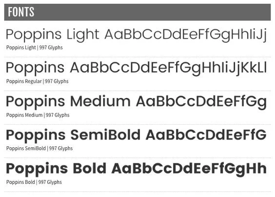
3. Consistent branding: As much as possible, we used consistent branding, color, fonts, and imagery across the two platforms. This ties the two sites together and makes them feel like separate areas of a single site.
Site Style Guide
Hex: #576238 RGB:87,98,56
Hex: #FAFAFA RGB:250,250,250
Poppins Font Family
The main site, built on Squarespace
The marketplace site, built on Sharetribe
Next Steps
The website has been launched and handed off to the client. You can view the current version of the site here: evolvebuildingsupply.org* Although the project has technically wrapped, improvements can always be made! Here are the suggestions I would make for the site moving forward.
*The current site may reflect changes made since the creation of this portfolio.
Various pages from the website
Continued user testing: Although the site was tested by numerous users, there are still areas I would like to refine after gaining user feedback. I would like to have members each of the ideal user groups give more specific input about the listing fields on the marketplace. Additionally, the company had a video made to explain the process of posting and claiming materials. I would like to experiment with incorporating some of that footage on the website and see if users understand and prefer video clips or written explanations.
Refining the design: Due to the limitations of the two website builders, there are still a few design inconsistencies between the main site and the marketplace site. I would like to dig into the coding behind the sites in order to create a stronger sense of visual cohesion.
Related Work
I also created a full brand overhaul for the evolve building business lines. Click on the image to visit the page highlighting that work.


